
For years, neutral palettes have reigned as the top choice for home paint decisions. Soft grays, whites, and safe beige tones became the go-to choice for walls, trim, ceilings, and cabinets. Neutrals are clean, flexible, and easy to decorate around. But recently, some designers and homeowners alike have started pushing back against that clean, uniform look.
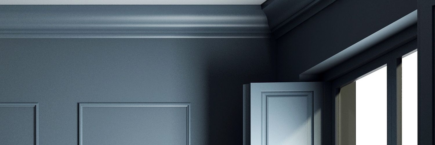
One of the most noticeable shifts is a design approach called color drenching. Instead of treating walls, ceilings, and trim as separate elements, this technique wraps an entire room in a single color from top to bottom, often in a richer color beyond a light neutral palette. The result is dramatic, immersive, and surprisingly refined.
For homeowners ready to move beyond predictable neutrals, color drenching offers a way to make a space feel intentional, cozy, and visually striking.
What Is Color Drenching?
Color drenching is exactly what it sounds like. Instead of painting walls one color and trim another, the same color is used across nearly every surface in the room. That often includes:
- Walls
- Trim and molding
- Doors
- Baseboards
- Built-ins or shelving
- Sometimes even the ceiling
Everything becomes part of one cohesive color story.
The goal is to eliminate the visual breaks that trim and ceiling lines typically create. By removing those contrasts, the room feels smoother, deeper, and more enveloping.
4 Reasons Why Designers Are Embracing Color Drenching
This trend has gained traction because it solves a few design challenges at once.
- It Creates Depth
When a single color covers multiple surfaces, shadows and architectural details become more noticeable. Crown molding, paneling, and millwork suddenly stand out because the light hits them differently.
- It Makes a Room Feel Intentional
Traditional paint schemes often divide a room visually. Color drenching removes those interruptions and makes the space feel more curated and complete.
- It Works in Both Small and Large Rooms
Ironically, this bold approach can actually make small rooms feel larger. Without contrasting trim lines, the eye moves smoothly around the room instead of stopping at every edge. A prime example is a half bath or powder room.
- It Adds Personality
After several years of neutral interiors, many homeowners are ready for spaces that feel more personal. Color drenching lets a room have a clear identity. That’s not to say a neutral color can’t be used for color drenching, but bolder colors are often just used. If you’re going to commit, why not go all out!?
Choosing the Right Color
While the technique is bold, the color choice does not have to be loud. Many of the most successful color-drenched rooms use rich midtones or earthy shades rather than bright colors, such as any of the 2026 paint colors of the year. But, if bright is what you want, so be it…
…but may we suggest some of the trending colors designers are exploring:
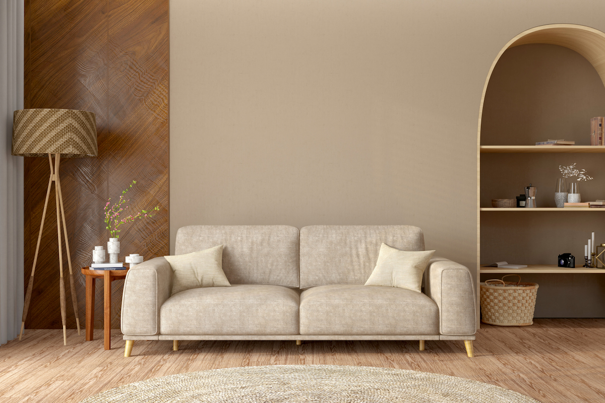
- Warm khakis and sandy neutrals that create a relaxed, natural environment. A neutral, but with more contrast.
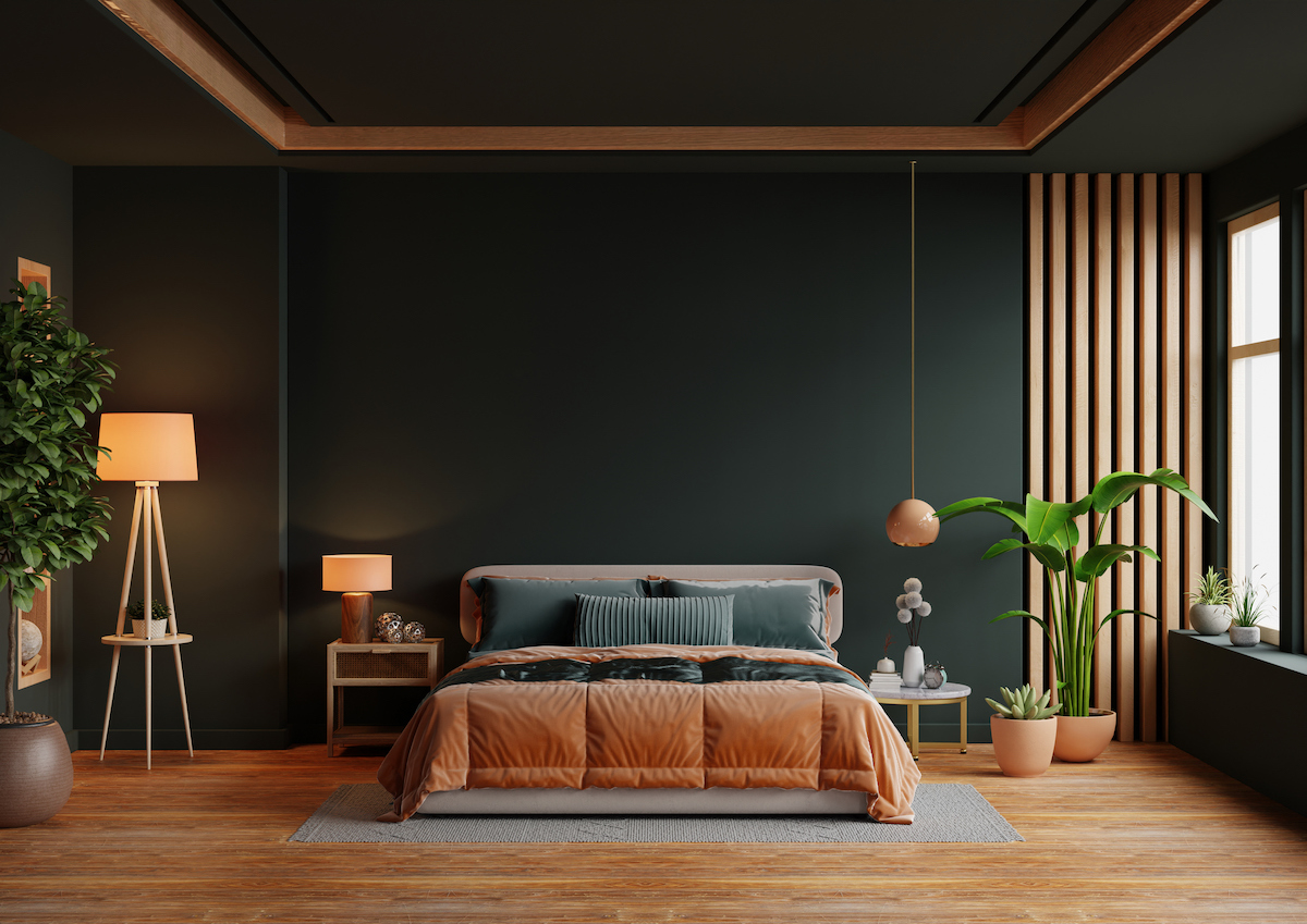
- Burnt umber and charcoal tones that add depth and sophistication. Think terracotta or rich clay tones.
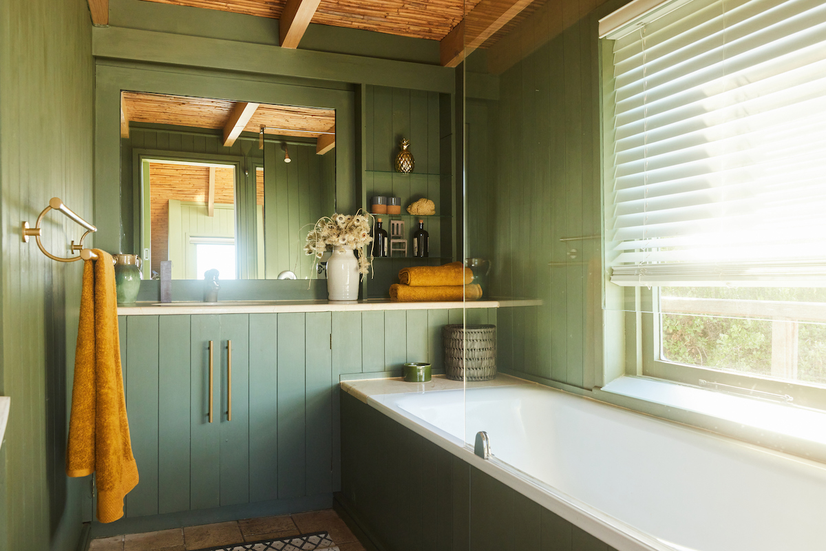
- Muted greens or smoky jade shades that feel grounded and calming. Complementary to the coastal surroundings of our area.
These colors work especially well when paired with natural materials like wood, stone, and linen. All of which screams quite luxury.
Where Color Drenching Works Best
While it can be used anywhere, some spaces benefit particularly well from the approach.
Home Offices
Using a single color throughout the room creates a focused environment without visual distractions.
Dining Rooms
Darker tones add atmosphere and can make the space feel more intimate.
Bedrooms
Soft, saturated colors can create a calming and cocoon-like effect.
Libraries or Reading Rooms
Built-in shelves painted the same color as the walls create a seamless, tailored look.
A Few Pro Tips Before You Try Color Drenching
Color drenching works best when it is done thoughtfully. Here are a few considerations before committing to the look.
Vary the finish.
Many designers use different paint sheens within the same color. For example, walls may be matte while trim is satin or semi-gloss. This keeps architectural details visible without changing the color.
Consider natural light.
Darker shades can feel rich and inviting, but the amount of daylight in the room should influence your choice.
Test before committing.
Test, test, test! Paint samples on multiple surfaces across the room to see how the color behaves throughout the day.
Balance with furniture and décor.
Neutral furniture, wood textures, or metallic accents can prevent the room from feeling too heavy.
Why This Trend Is Resonating Now
Color drenching reflects a broader shift happening in interior design. Instead of playing it safe, homeowners are leaning toward spaces that feel layered, expressive, and comfortable.
After years of gray-on-gray interiors, people are rediscovering the power of color. Not just as an accent, but as the defining character of a room.
And sometimes the most interesting design choice is simply committing fully to a color and letting it shape the space.
If you have lived through the era of safe neutrals and are ready to try something different, color drenching may be the perfect way to bring depth, personality, and a little boldness back into your home.
Sometimes the best way to color outside the lines is to paint right over them.